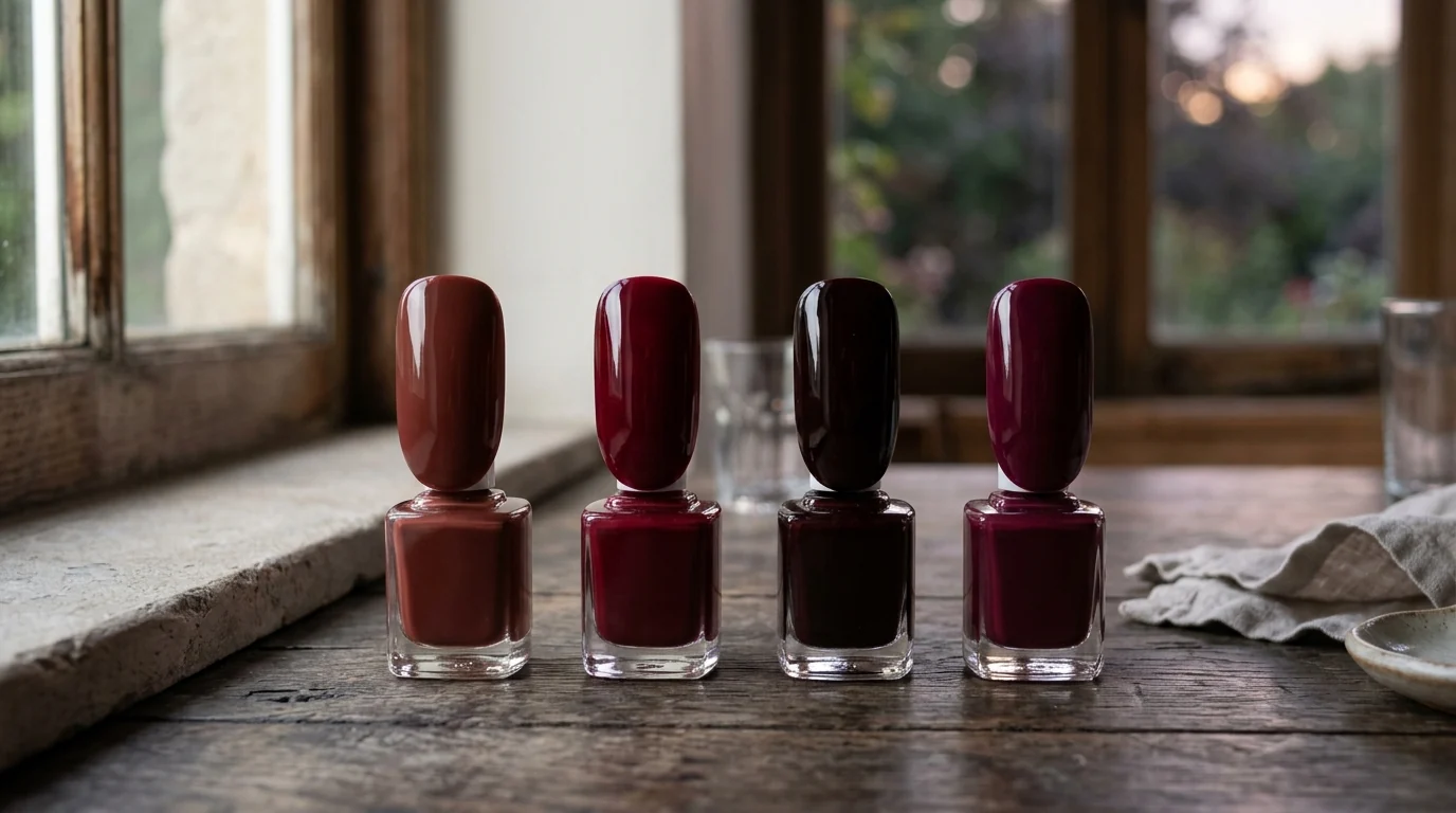
Set four deep-red swatches at a window and the darkness begins to separate. One carries a softened brown-red warmth, another sends a cool blue-red trace to its edge, a third lets red glow beneath an almost black surface, and the last releases violet through the red. From across the room they can all register as a dramatic dark manicure; window light makes their different temperatures, shadows, and afterimages legible.
At the Window, the Red Splits
Burgundy often opens as brown-red. Its depth has earth in it: red cushioned by a warm shadow rather than sharpened by blue or violet. The result is full and settled, as if a brown veil has passed over the red without erasing it.
Undertone trap -- begin at the outer edge, not the dark center.
The center of a very dark swatch can look like one uninterrupted field. In daylight, look instead at the perimeter: an earthy browned cast suggests brown-red, a cooler trace suggests blue-red, a nearly black surface points toward oxblood territory, and a violet lift signals purple-red. What remains visible beneath the depth does the sorting.
Wine can take burgundy's rounded, warm direction too, especially when its darkness feels softened rather than inky. But a blue-red wine changes the air around the same depth. The red stays dark while its edge appears cooler, cleaner, and faintly blue; it does not need to announce blue to hold that crisp cast beside a warmer dark red.
Screen warning: a display can flatten the separation between cool and warm dark reds.
Screens can shift or compress a swatch's impression, particularly where a blue edge, a brown veil, or a violet undertow is slight. Use the image as an editorial cue, then let daylight on the actual bottle or salon swatch show which undertone is present.
Shade Makes the Families Trade Weight
Step away from the window and into shade. Burgundy loses some of its warm glow and becomes more hushed; a blue-red wine retains a cooler line in the shadow; oxblood gives the eye its dark surface before the red beneath it; plum lets violet hover closer to the darkness. The families are not fixed measurements. They are perceived directions that change with the light.
This is where burgundy and wine can seem to exchange names. A warm wine may read brown-red, while a burgundy with a cooler edge may look more inky than expected. The useful distinction is still the visible undertone: rounded earth for brown-red, or a clean cool cast for blue-red.
On the bottle label, burgundy and wine may trade places.
Burgundy, wine, oxblood, and plum are editorial color language, not standardized measurements. Bottle glass, salon labels, and brand naming can change the first impression, so treat the printed name as a direction and read the color by its undertone and the light around it.
Oxblood belongs to the near-black-red direction. It is dense and shadowed, with red appearing from underneath rather than sitting plainly on the surface. It is not black with a red name; the submerged red is the effect. Pinot-noir coverage describes a deep, glossy red with black-cherry/garnet associations, placing it in this polished, fruit-dark territory.
Naming caveat. Pinot noir describes a black-cherry/garnet direction, not one fixed swatch.
The pinot-noir image is a deep glossy red with black-cherry and garnet associations: lacquered darkness with garnet light moving under the surface. Different bottles or salon labels can place that direction nearer oxblood, wine, or another dark red, without changing the editorial reading.
Plum takes the purple-red route. Red remains visible at its center, but violet moves through the depth, from a quiet murmur to a more apparent bloom. In shade it can feel duskier than wine and less earth-bound than burgundy, while staying a red-centered darkness rather than becoming simply blackened red.
Evening Interior Changes the Surface
Under interior light, finish decides how much of the undertone keeps moving. Gloss makes a deep red feel lacquered, reflective, and more liquid; it gives oxblood a black-cherry/garnet glint, lets wine hold a cool flash, rounds burgundy's brown-red depth, and can make plum's violet rise through the reflection. Velvet matte absorbs the highlight and turns the same colors softer and more textile-like.
Finish experiment / move one deep-red swatch from gloss into velvet matte.
Leave a thin glossy line at the tip or cuticle against a velvet-matte field to show the contrast. For a reflective addition, keep chrome narrow: a smoked-chrome French edge, fine central stripe, or small crescent at the base catches light like dark glass. A broad mirror finish takes over the design.
A four-dark-red manicure stays composed when one shade remains the uninterrupted field and the other three appear as small, repeated gestures. A pair of half-moons, one reverse French line, or alternating accent nails gives the changing reds a shared rhythm without flattening their differences. Negative space can make the dense colors feel airier: a slim vertical opening lengthens a color block, while a curved cutout near the cuticle creates a softer graphic pause.
For an evening-ready result, quiet materials and precise details let the color carry the atmosphere: a black silk cuff, brushed gold hardware, a dark espresso bag, or a sharply shaped tip. Burgundy can hold a leather-bound brown-red hush, oxblood a glossy near-black pause, and plum a violet-red dusk note without competing textures around them.
Notebook, Recorded After the Walk
After the window, shade, and interior-light pass, the swatches reduce to this working record.
| Family | At the window | In shade | Under evening interior light |
|---|---|---|---|
| Brown-red | Warm, softened depth; burgundy or some wine reads | Earthy red settles into a brown veil | Gloss rounds the warmth; matte makes it textile-like |
| Blue-red | Cooler red appears at the edge; wine carries a crisp, inky cast | A clean cool trace remains inside the shadow | A narrow reflection preserves the cool flash |
| Near-black red | Red appears beneath a dark surface; oxblood or black-cherry/garnet direction | The dark surface arrives first, then submerged red | Gloss draws garnet light from the lacquered depth |
| Purple-red | Violet presence moves through red; plum keeps red at its center | Violet hovers closer to the darkness | Reflection can bring the purple undertow forward |
At dusk, four bottles stand in the fading window reflection, their brown-red, cool-edged, black-cherry-garnet, and violet-red glints slipping together across the glass.