
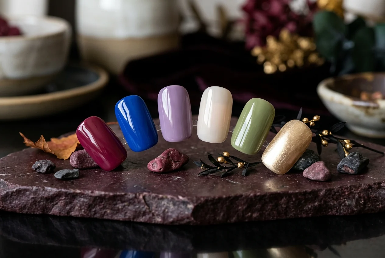
Late summer light has a particular way of changing color: brightness stays, but the edges soften. A raspberry can feel less like peak-season fruit when it sits near olive. Cobalt becomes sharper beside a milky neutral. A pale champagne sheen catches the last warm light without asking for a full metallic moment.
This is a palette for that in-between weather, arranged by temperature, contrast, opacity, and finish. Raspberry, cobalt, ube or lavender, milky neutral, olive or matcha, and soft champagne metallic offer different ways to move from sunlit color toward a quieter depth.
Begin with the light
Soft champagne metallic and milky neutral make an easy opening note because both leave room around the color. Champagne brings reflected light with a pale warm-neutral cast; milky neutral brings a clouded, low-contrast calm through beige, pink-beige, or quiet cream-adjacent territory. One glimmers. One diffuses.
Together, they can set a gentle register before a stronger shade enters. Place champagne next to raspberry for warmth with a little lift, or let it sit beside ube or lavender for a cool-warm exchange. Milky neutral can do the same work more quietly, acting as the pause between cobalt and olive, berry and violet, or any other more concentrated pairing.
Here, undertone is simply a way of describing the cast a shade appears to have: red-forward, blue-leaning, yellowed, muted, cool, or warm. It is not a rule about what will suit a particular person. Opacity works in much the same editorial way. An opaque color reads as a clean block; a milkier reading lets the edge of the color blur.
Swatch legend
| Color direction | Temperature and undertone | Light and finish | Pairing role |
|---|---|---|---|
| Raspberry | Berry warmth, either red-forward or blue-tinged | Clear cream or softened berry depth | Use milky neutral for quiet or champagne metallic for light |
| Cobalt | Cool, saturated blue | Opaque, high-contrast cream impression | Set against olive for color blocking or neutral for open space |
| Ube or lavender | Cool violet, from fuller purple to softly greyed lavender | Milky, creamy, or lightly luminous | Bridge to raspberry or meet champagne in pale warmth |
| Milky neutral | Quiet beige, pink-beige, or softly clouded neutral | Diffused, low-contrast, soft-focus | Create breathing room around any stronger note |
| Olive or matcha | Earthy muted green or clearer yellow-green | Velvety cream or softened color block | Ground raspberry, sharpen cobalt, or mellow with champagne |
| Soft champagne metallic | Pale warm-neutral light rather than overt yellow gold | Fine, restrained metallic sheen | Bring luminosity beside berry, violet, green, or neutral |
Cool color after the glare
Cobalt is the crispest line in this group. Its saturated cool blue can hold its own against the softer, milkier shades without making them disappear. With a milky neutral, the composition becomes strong color and open space. With olive, it turns more graphic: blue beside a muted green reads differently from blue beside a clearer, more yellowed matcha. That uncertainty is useful. It leaves room for the palette to feel tonal one day and sharply blocked the next.
For a gentler blue reference, see washed denim blue nails. Denim's softer framing is a neighboring idea to cobalt's concentrated presence.
Ube and lavender lower the temperature another degree, though they need not look cold. Ube names the fuller, purple-leaning end of the violet range; lavender names a lighter or more softened version. Let a milky violet linger near neutral, or give it a creamier, clearer read when the palette needs more color. Raspberry nearby creates a berry-to-violet conversation. Champagne lets in a small wash of pale warmth.
For a violet-focused companion, see lavender milk nails. Lavender can lead the composition, soften its middle, or remain one small note in a broader seasonal mix.
Where the palette warms and settles
Raspberry carries warmth without requiring the blunt directness of red. A red-forward version feels lively and clear; a bluer one folds more easily into violet. Either can sit beside milky neutral when the color needs a clean frame, or beside soft champagne metallic when the composition wants warmth beside pale reflected light. Raspberry and lavender are especially persuasive when their finishes share a similar softness. Less opposition, more conversation.
Then the greens arrive. Olive has an earthier, more muted cast, often softened by yellow or brown; matcha reads clearer and more yellow-green. The labels overlap, and they are not fixed color standards. They are useful handles for deciding whether green should settle into the composition or spark against it.
Olive beside raspberry suggests fruit and foliage without becoming literal. Matcha beside cobalt makes the contrast more immediate. Champagne can warm either green with a veil of light, while milky neutral gives the pairing a little air. Cream finishes keep the color blocks straightforward; the metallic option changes the surface rather than replacing cream altogether.
Questions of color
How do I choose between a red-forward and blue-tinged raspberry?
Choose a red-forward raspberry when you want the palette to hold more visible warmth, especially beside champagne or olive. Choose a blue-tinged raspberry when you want an easier path into ube or lavender.
When should the palette lean opaque rather than milky?
Use opaque color when cobalt, raspberry, or matcha should read as a distinct graphic note. Choose a milkier interpretation when lavender or neutral is meant to soften the edges and lower the contrast.
Which finish should carry the light?
Let soft champagne metallic carry reflected light when the composition needs a pale luminous accent. Keep the neighboring shades creamy when you want the metallic to remain a small gleam rather than take over the surface.
What gives cobalt a balanced pairing?
Milky neutral gives cobalt open space and a calmer frame. Olive creates a more graphic blue-green contrast, while a softened lavender can keep the cool side of the palette more tonal.
How can I narrow the six directions to one cohesive mood?
Begin with one color that carries presence, add either a milky neutral or champagne for air and light, then choose one supporting shade that shifts the temperature. Limiting the mix to three notes keeps the story clear.
Source note
No external sources were supplied for this closed editorial brief, so there are no external links or provenance claims. This is an editorial palette (not a safety comparison); no video is included, and it makes no popularity, testing, or performance claims.
A three-color capsule
As the light turns gentler, let one shade hold the warmth, one create a clouded interval, and one catch the remaining glow. The result moves easily from a sunlit afternoon into an evening with cooler air at the edges.
For the cleanest close: raspberry, milky neutral, and soft champagne metallic.