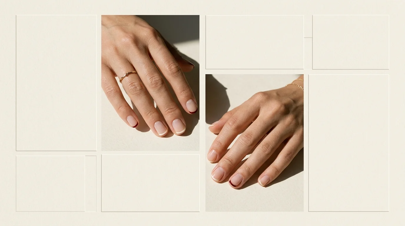
At the free edge, a micro French works like a hairline rule at the bottom of a page.
Point Size Before Pigment
In this article, micro French and baby French describe for this narrow treatment, although the wording can shift between salons, regions, and creators. The editorial distinction sits in the proportion: an ultra-thin line follows the free edge, while a classic French reads as a broader band of edge color.
Line weight establishes the hierarchy before color enters it. A near-invisible stroke can behave like a boundary; a slightly fuller stroke still belongs to the micro French idea when it remains visibly slimmer than a classic band. The edge does not need to disappear. It needs to stay typographic rather than become a block.
The Margin Expands With the Nail
Nail length determines how much margin the line has to occupy. On a short nail, the micro tip can register as a final, compact stroke, especially against a base close to the natural nail. More length gives the same line more perimeter to travel across without turning it into a band.
Shape edits that margin. Square and soft-square outlines present a comparatively straight span, so the edge can look clipped and graphic. Oval and almond outlines carry the line around a curve, allowing it to read as a more continuous trace. The silhouette already on the nail supplies the measure; the line weight must remain legible without expanding into classic French territory.
For adjacent proportion studies, see milky French tips for a softer base contrast, short square nails for a flatter edge, and Italian manicure on short nails for another short-nail frame. They are neighboring visual vocabularies, while micro French remains defined by its ultra-thin free-edge line.
Contrast Is the White Space
Base contrast decides how loudly the edge separates from its field. A soft base and a pale, closely related edge keep the page quiet. A clearer value difference gives the same thin line a firmer outline. Neither arrangement changes the essential proportion; contrast changes the first read, while line weight keeps the edge a line.
Finish moves light across both areas. Soft sheen can keep the distinction restrained, while high shine or matte makes reflection part of the contrast. The surface may alter how wide the margin appears, particularly with a dark glossy edge, but it does not alter the actual width of the painted line.
A Hypothetical Brief That Goes Heavy
A failed brief asked for a dark, glossy tip that would announce itself at once, then piled strong contrast onto the base. Every instruction enlarged the same narrow perimeter. The result confused a typographic rule with a colored band. A proofreader would return it with the following correction sheet.
| Marked variable | Overstated instruction | Corrected direction | Read on the nail |
|---|---|---|---|
| Line weight | Make the tip a clearly visible stripe. | Keep the free-edge stroke hairline or only slightly fuller. | The edge remains separate from a broad classic French band. |
| Base contrast | Push the base and edge far apart. | Choose close values for a quieter read, or separate them only as much as needed for definition. | Contrast controls how firmly the line announces itself. |
| Edge color | Make color do the work by broadening the tip. | Let pale, related, deep, or saturated color stay inside an ultra-thin line. | Color adds emphasis without changing the proportion. |
| Finish | Add reflection to increase the edge. | Use soft sheen, high shine, or matte as a light decision rather than a width decision. | Reflection changes the margin's optical read, not its actual width. |
| Length and shape | Force one edge treatment across every silhouette. | Follow the existing free edge on short square, soft-square, oval, or almond nails. | The available margin and curve determine how the line travels. |
The correction sheet is not a formula. A close base-to-edge pairing can leave room for a more reflective finish, and a darker edge can stay precise when its line weight is restrained. Crowding begins when contrast, width, color, and finish all demand equal attention at the border.
Deliberate Misalignment
A split-color edge introduces a controlled interruption rather than more line weight. At the midpoint of a long almond curve, a sharp change can segment the outline; closely related colors soften the handoff. Greater contrast turns that midpoint into intentional punctuation, while the thinness of the line remains unchanged.
Salon brief: Specify an ultra-thin free-edge line, not a broader classic French band.
Salon brief: Set line weight before selecting edge color.
Salon brief: Choose base contrast for a quieter or more defined edge.
Salon brief: Let nail length, shape, and finish complete the proportion.